In the ever-evolving world of data, one of the fundamental tools used to analyze and interpret information is the humble histogram. This time-tested instrument offers intuitive insights into numerical data by illustrating it in a visual, accessible format. Histograms are pivotal in transforming large, complicated sets of raw data into clear, coherent graphs. They enable us to detect patterns, trends, and variations that might otherwise be difficult or impossible to discern. Keep reading to delve into the fascinating world of histograms and discover their various benefits in data analysis.
Understanding the Histogram
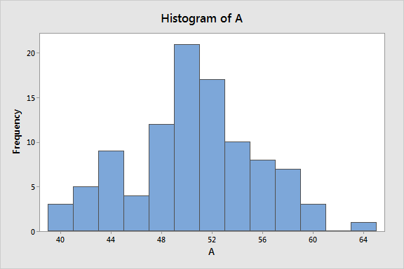
Before delving into the benefits of using a histogram, it’s crucial to get a better understanding of this powerful data visualization tool. Simply put, a histogram is a graphical representation of a data set that organizes a group of data points into a specified range. This effectively translates complex numerical information into an easily digestible visual format. Unlike bar graphs, which represent categorical data, histograms portray numerical data in an accessible format.
Moreover, in a histogram, there is no space between bars, as they are intended to depict continuous data. Furthermore, the area of each bar corresponds to the frequency of occurrences for each data bin. This difference may appear minor but has significant implications for the interpretation of the data.
Perhaps the most appealing feature of a histogram is its simplicity. It makes data that might otherwise seem overwhelming or unintelligible manageable and clearly understood.
Histograms Simplify Data Interpretation
A significant part of data analysis is its interpretability. No matter how excellent or innovative your data may be, if you can’t interpret it, it’s of no use. This is where histograms come in; they offer a straightforward way to visualize data. They make it possible for anyone, regardless of their data literacy level, to comprehend and interpret data correctly. This ease of interpretation makes histograms a favored tool in data analysis.
Through histograms, you can easily identify the frequency of various data points, locate the most frequently and least frequently occurring elements, and much more. They demonstrate data distribution more noticeably than tables or other data collection tools. Thus, using histograms greatly simplifies data interpretation, making findings accessible to a range of audiences.
Moreover, histograms allow for improved communication between teams or departments. With a histogram, you can easily display complex data sets in a visual format that anyone can understand. It cuts through any potential confusion and ensures that everyone is on the same page. This simplification of data interpretation is another reason why histograms are heavily relied upon in data analysis.
Histograms Help Identify Patterns and Trends
A well-constructed histogram can lead to the identification of patterns and trends in big data that may not be apparent through a mere tabular representation of data. A histogram makes these trends apparent at a glance, providing a broad understanding of the overall distribution of the data.
For instance, you can easily tell whether the data follows a normal distribution or if it skews to one side. This kind of information can be crucial in many sectors, including business and marketing, where understanding customer behavior patterns is pivotal. Analyzing these trends can offer insights into future patterns, helping to guide strategic planning and decision-making.
Patterns in data don’t just provide insights into the present; they also give a glimpse into the future. Recognizing past trends enables professionals to predict future behavior accurately. Whether it’s predicting stock prices or planning marketing strategies, the ability to identify trends is a potent tool in data analysis.
Optimized Decision-Making with Histograms

Market trends, customer behaviors, and internal processes are just a few areas where histograms can help make sense of large volumes of data. By consolidating data into a visually appealing and interpretable format, histograms can aid in strategic decision-making within an organization. They not only provide a snapshot of the present situation but can also indicate future trends and changes.
With histograms, decision-makers can see the most relevant data points and weigh their options more effectively. They can uncover hidden patterns in the past and predict future developments with greater accuracy. As a result, they are well-equipped to make data-driven decisions that benefit the organization as a whole.
Businesses can’t work on intuition alone. In today’s data-driven world, making informed decisions is crucial for success. Histograms make this possible in a clear, straightforward manner, optimizing the decision-making process and driving strategic progress.
Histograms, with their immense potential for revealing hidden secrets inside large amounts of data, are powerful data visualization tools that every analyst should master. Whether you’re an experienced data scientist or a student learning the basics, the histogram’s simplicity, clarity, and depth offer a unique tool for translating complex numerical data into an accessible visual format.